Case Study

Phoenix Fall Party

How a deep dive into Art Deco Design, an understanding of brand fundamentals, and a bespoke visual strategy helped Upgrade's Phoenix Fall Party event look on theme and distinctly theirs.

Creative Strategy

Presentation Design

Print Design

Animation

Visual Storytelling

* Some artifacts have been modified or recreated for illustrative purposes. All photography, personal data, and proprietary information has been replaced with stock or generic content to protect employee privacy and company confidentiality.

Introduction
Overview
Upgrade’s Phoenix Fall Party is an annual ritual to celebrate the year’s accomplishments, appreciate the work of team members in Operations, and overall drive location-leadership’s vision of making the employer the "place to be.” The attendance for 2023 and 2024 ranged from ~400-700 people, non-Phoenix Operations team members fly-out to attend, and there was no sign of that stopping in 2025.
Historically, I’ve supported this event by supplying the visual promotion assets for the larger comms campaign and the themed annual recap deck. Status quo for everything else involving the event, including collateral like menus, signage, drink tickets, raffle tickets/slides, etc. was handled by the Office Experience Team (OET).
This norm changed in 2025 with me becoming an integral part of the experience and visual strategy build-out for the event. The result was a visual strategy that centered the event's theme, honored the brand, and made the most
Looking back on 2024
The year before (in 2024) I wanted to start supporting this annual event with event collateral (as I’ve done with smaller events like the Spring Picnic and ERG events). It was likely going to be the largest party (so far) and I wanted to be a partner in helping the experience come to life.
There were a few things that happened in 2024 that informed how this project was handled in 2025.
What happened in 2024

flag

Promotion assets/deck and collateral assets were aesthetically misaligned due to miscommunication on theme and weak feedback loops.

flag

The deck needed to be converted to video at the last minute due to company drive sharing settings that prevented us from sharing with the A/V vendor.

flag

The raffle process was good (in theory) but lacked the staffing needed to make the process of drawing, recording, and displaying the names a seamless process. This lead to display cues being missed or delayed, and confusion amongst winners.

I saw 2025’s party as an opportunity to try what I tried to accomplish in 2024, but with the foresight and knowledge that I gained from that experience and throughout the year.
My plan to approach 2025

check

Act as a more hands-on part of the party planning process early-on, position myself with the organizers as a creative partner to help bring the vision to life.

check

Stretch the limits of Upgrade’s visual identity to capture the aesthetics and feeling of the theme. (Art Deco/Roaring Twenties)

check

Lean into last year’s constraint of needing to convert the deck into a video by animating the slides in After Effects.

My roles and responsibilities
Visual Design Lead
Worked with primary event organizer to define the overall creative direction for the event; established an Art Deco inspired visual system across all promotional and collateral touchpoints, including typography, color, pattern, and illustration.
Illustrator
Designed the original Art Deco pattern system and adapted existing brand illustrations to support the theme.
Motion Designer
Conceived, storyboarded, and animated the full-length After Effects video deck to display as an ambient experience at the event; developed all animation templates, transitions, and reveal sequences.
Brand Strategist
Audited Upgrade's visual identity for Art Deco compatibility; determined what to carry over, adapt, and deviate from across logo, typography, color, shape, and illustration to balance theme with brand integrity.
Print Production Designer
Designed and prepared all professionally printed and in-house printed event collateral for production, including raffle tickets, drink tickets, bar menus, signage, and raffle display templates.
Cross-functional Collaborator
Partnered directly with the Office Experience Team organizer, other visual designers, and design leadership to align on creative direction, scope, and deliverables; maintained feedback loops throughout the project lifecycle.
Event Day Coordinator
Worked on-site with A/V to manage ambient display and raffle winner sequences, applying lessons learned from 2024 to ensure a seamless live experience.
Guiding Question
How do we design a cohesive branded experience that leans into the historical theme while honoring the brand?
"Upgrade... but make it Art Deco"
Research and intake questions
I wanted to approach this project very thoughtfully, so I did a kickoff on my own by listing out a set of questions and ideas to guide some pre-exploration. I wanted the bones of the visual direction to be rooted in some of the artistic and cultural history of the era. At the same time, I also wanted to keep my research's focused on addressing the needs of the event.
Here were my research questions:
  • What elements of reality should be tied into the theming?
  • If they had it, what did branded collateral for speakeasies/clubs look like at the time?
  • What display trends/formats existed at the time? What were common mediums for visual mass communication? (e.g. marquee-style text for raffle winners? newspaper for news articles? etc.)
  • What brand assets can be adapted to support the Art Deco aesthetic?
Additionally, I had a few items that were still up in the air that I needed to sync with the organizer on. I listed out the questions that I still had to ensure all bases were covered and I didn't get too ahead of myself (I was very excited about this project).
Here were those lingering questions to answer with the organizer, later:
  • What is your overall vision and plan for this event? Are you wanting to recreate the look of a specific slice on 1920s nightlife, or curate a more 2013 Gatsby-esque take on the era?
  • What do you think about the overall direction of the exploration and planning? Anything you’d like to add? (noted for future meeting, exploratory work came a few steps after this)
  • What ways can I support the planning process and actual event day to help make sure we’re able to see this vision through?
After I had my questions, I dove into research and documented what I found in my notes, and added visual examples to a digital pinboard to share in my exploratory check-in.
Looking at elements of reality
To help connect with the roots of the theme, I decided to start my research by verifying a few historical facts about the era and diving into the culture at the time, Art Deco methodologies, and overall visual trends/techniques.
A lot of the modern A/V outputs we use today, such as movie projectors and speakers, have a direct lineage to the phantoscope and gramophone.
Both technologies were patented in the United States in the late 19th-century.
Animation was still in its infancy at the time, but early animation styles such as rubberhose were first seen in the late-20s (but didn’t become mainstream until the 30s, onward.)
Animated title cards for silent films were also used at this time.
Speakeasy tickets (essentially membership cards) were a common thing at the time.
These granted entry to a particular speakeasy, but didn’t call attention to what the establishment actually was.
Art Deco uses a core set of shapes/line-weights that frame a centered focal point. To add a sense of grandeur, secondary shapes fill the negative space with intricate patterns. Harmonic contrast is achieved through varying density, rounding, and scale.
Rich jewel-tones were popular colors. Metallic gildings such as gold and silver were fashionable finishes, as were luxurious fabrics like velour, velvet, and silk.
Art Deco Core Characteristics

check

Bold geometric shapes and overlapping lines

check

Ornate typography

check

Metallics like gold, silver, or copper

check

Rich colors such as jeweltones

check

Symmetrical compositions

Once I had a grounding point for the theme by understanding the era, I was ready to think about what brand assets can be used and adapted to sell the vision of a 1920s Upgrade party.
Examine the brand's assets
Then I took a big picture view of our core brand assets and worked on determining what needs to be carried over and what should be changed to fit the theme. To keep my focus tactical, I examined the core pillars of the visual identity:
Logo

Use variant

arrow_split

The wordmark's typography is too modern, but adapting that would’ve required a lot more exploration and testing than time and resources allowed. Since the audience will be Upgrade team members (and their plus ones), this was a valid use case for using only the logo mark.
Graphik (Regular, Medium, Semibold)
Typography

Adapt for theme

edit

The identity's primary use font, Graphik, is subtle enough to be used for body text but also looked too modern as a primary treatment. In this case, I decided it’d be a valid instance of delineating from standard and explore more on theme typography.
Color

Curate for theme

arrow_split

Our color system has the colors needed to fit the theme. The solid colors should stay on the dark side of the system, since that leans heavily on rich jewel tones. The system has enough range to mimic metallic materials, and create a sense of depth.
Shapes

Use as-is

check_circle

Our stated brand shapes have some distinctive options to pick from (such as the upward curve, ‘U’ shield, circle, and leaf.) Since these are very curvy shapes, they can be leaned on as core shapes and focal points, while using more angular shapes in the finer details.
On brand illustration sample
Illustration

Adapt for theme

edit

llustration's silhouettes can be largely kept as is since the style is such a distinctive piece of Upgrade’s brand system, and isn't so modern or trendy that it takes you out of the theme.
To help demodernize things a bit, experiment with tweaks that'll help align the style with trends and techniques of the time.
Explore the basics
Experimenting with type
Display type trends at the time were strikingly bold and opulently ornate, and I wanted to explore different typefaces with this in mind.
Taking cues from the lettering on the façades of the buildings' collected during research, I narrowed down three distinct typefaces to experiment with.
AM Udine
Lubaline
Art Deco MN
After playing around with a few lockups for the party name (“All that Jazz”) and the composition for the save the date, I decided on a type pairing of AM Udine and Lubaline.
Pairing example
Both would be used flexibly throughout all of the assets, with AM Udine being primarily used for longer headlines and as an accent pairing with Lubaline. Lubaline would be used sparingly for moments of emphasis.
Find a pattern direction
An advantageous part of Art Deco is that its prioritization of symmetry and replication makes it easy to scale and adapt to different formats in a way that’s consistent and enticing. Given the intricacy required to pull this off, I wanted to get the ball rolling on this as soon as possible.
Using the save the date as an establishing asset, I made 3 different rough options with outlines of the core shapes. I saw this as the first step to creating the pattern, and getting the organizer’s buy-in for a certain direction early on will help prevent misalignment later on.
Getting everyone on the same page
I went over my plan and early explorations with the other visual designers. This was to mainly to align on the overall direction and my approach to theming the brand. After I got buy-in from them, I felt ready to go over my proposal with the organizer.
The goal of this meeting with the organizer was to get on the same page on all the moving parts with this project. This meant going over what's needed from one another, decide on a direction based on the exploration work so far, and uncover any constraints we'll need to consider.
Pattern direction
We decided to go in the direction of featuring the ‘U’ shield as the prominent shape on the pattern for vertical compositions and the leaf as the prominent shape for horizontal compositions. Since all drafts used the shield, I went with draft three due to its simplicity so far.
Deliverables

check

Pattern system

Must be compatible with vertical, horizontal, and square formats.

check

Promotion collateral

Posters | Save the date | Digital signage | Outfit lookboard | Food menu preview | Raffle item preview

check

Print day-of collateral

Bar menu | Raffle tickets | Drink tickets | Environmental signage (wayfinding, event schedule, etc.)

check

Digital day-of collateral

Ambient display deck | Raffle item slide template

check

Day-of A/V and raffle support

Work with A/V on display coordination throughout the event and populate the winner slides during the raffle.

Constraints to consider

warning

Professional printing will be used for raffle and drink tickets only. All other print collateral will be printed in-house on an office laserjet printer.

warning

The display deck won't have a dedicated watch time or have narration, so each moment must be able to stand on its own.  

warning

Raffle winners slides will need quick, real time updates. As a contigency, the template should be easy to update and share in case the original day-of plan can't work out.

warning

Logistical details will continue to get ironed out leading up to the event. Designs must be flexible enough to accommodate any shifts in information.

Bring the vision to life
Build the pattern system
I first got to work on solidifying the pattern system, as that will be the visual anchor for all of these assets.
I decided that a narrow but intricately designed frame around the core shape would create a distinctive framing device that could be used across the different mediums.
Using a 16 row and 16 column grid on the vertical orientation as a baseline, I was able to designate quadrants for symmetry.
The corners will be anchored by the squares. To align this to the grid system, I matched it to the row height rather than the column width.
close
check
I designated three differently sized sections of the quadrant to chunk the pattern. Since the top corner bookend was set to one row high, I decided to make the section after it 4 rows high. This was primarily to avoid creating an additional line of symmetry across the entire composition, which would’ve lead to awkward geometry.
With my other bookend’s height established, I moved on to the bottom bookend of the quadrant.
I did this to ground myself in how the bookends of the pattern look together, and what the natural transition would be for the middle.
The corner squares are the main anchors for the pattern and should remain the widest. With this in mind, I reduced the width footprint from 1.5 columns to 1 column. In terms of shapes, I found that a rhombus gave the angularity and sharpness often found in art deco designs, and a narrow rectangle underneath to contrast it (about ⅓ the rhombus’s width, equal height.)
With the “bookends” set, I moved on to the middle part.
I wanted the middle to help facilitate the transition from the top bookend to the bottom. Since squares/rectangles and a rhombus have been used so far, it made sense to continue using the rectangles and begin introducing the sharp angles of the rhombus with triangles.
Now that I had a quadrant set, I took a look at how it adds or takes away from the bigger picture before I committed this to the other quadrants and put together the variants. One thing I noticed was that the frame felt too jagged and the brand-shapes looked out of place because of it.
To help literally round things out, I decided to round the left and right corners of the rhombus to create a teardrop leaf shape. This helped add some common ground between the frame and brand shape, without sacrificing the desired geometric contrast.
I also added some additional density to the corners, and then added the pattern to the other sides of the quadrant.
A circle was used to connect things on the top-down axes.
At this point, the outer frame looked great on its own, but the brand shape was less prominent. To correct this, I made two copies of the shape, scaled one up by a half row-height, and the other down by the same increment.
So far, reflectional and point symmetry has been used. I thought adding a layer with radial symmetry would really bring this where we needed it to be. There was some negative space to fill, and I noticed that sunbursts were a common motif in Art Deco. Since it’s so simple, it seemed that it would adapt to the different aspect ratios easily.
This pattern will have to adapt to different orientations with minimal changes.
I rotated the lines in increments of 5º since that seemed like a friendly number for facilitating needed adjustments. This will make things like removing/adding rays, or rotating the group between horizontal/vertical formats easier to execute.
As more details continued to get added on, I noticed that the namemark for “All That Jazz” was starting to get lost.
To give this its own framing device, I started by overlapping and scaling rhombi and rectangles.
To give the container a wider span and more prominence, I layered a long version of the leaf brand shape, and a slightly longer fully rounded rectangle. This choice of shapes added an additional brand moment with the leaf, and some balance to the already angular container.
Once the namemark was framed, the pattern seemed ready to adapt to horizontal and square formats. Since the left-right axis is connected by horizontal lines, the width of the frame can be easily adapted across formats. Here are the specific decisions made for square vs vertical formats:
Color
Since our primary brand color is green, it made sense to use this as the prominent color. I also noticed that printed Art Deco graphic design would use either marigold as a stand-in for gold, or higher quality prints would use actual gold leaf. I decided to explore both directions.
The brand shade closest to marigold looked good on the green, but it wasn’t selling the lavishness that the event was aspiring to.
The gold gradient, which is made from the brand's full spectrum of yellow shades, added some depth and conveyed the old-school elegance that the theme embodied.
Inspiration
Since promotion's primary objective is to sell the theme and desirability, the strategy was to lean into the gold leading up to the event. However, to reinforce the immersive theming and prevent the party from becoming a sea of digitally rendered gold, the day-of collateral would primarily use the brand's accent green. Gold would be used sparingly, but primarily on printed assets.
Promotion asset examples
Party asset examples
Print Collateral
The print collateral was going to be printed professionally and in-house. The professional printing was for the smaller, high volume assets like drink tickets and raffle tickets while in-house printing was for the more singular, standardly sized assets (like bar menus, schedules, etc.)
For print as a whole, I wanted to evoke the sense that they were printed using non-digital techniques (even though they will be digitally printed). This meant maintaining a more monochromatic palette to emulate the cost constraints at the time (prints were charged per color) and adapting the illustrations to emulate lithographic printing.
To help accommodate the all green color scheme, I modified the illustrations to deviate a bit from the standard. Since complex lithography is essentially different layers stamped on top of each other, I approached each color as a “pass.” I also applied the gold gradient sparingly to simulate gold leaf and add dimension.
Since the drink tickets were going to be so small, the square adaptation of the pattern lost detail at viewing size— I decided to take tabs from the party namemark container, and made a simple Art Deco style pattern with squares and rhombi, and I added curves in the corner for contrast and as a call to the brand.
I also added these curves to the raffle ticket to give a common thread between the two. An additional deviation I made for the raffle ticket was with the typography for the first and last name. Lubaline had legibility issues at small sizes and AM Udine, as the typeface for “Raffle Ticket” looked too monotonous for the name. Graphik also looked too modern, and was licensed, meaning the printers wouldn’t be able to populate the template to fidelity (OET outsources that to them.)
I decided to lean into the need for deviation, and selected a serif typeface that reminded me of the serif type used on the speakeasy membership cards. I selected the best one based on open accessibility and how it looks with the rest of the palette.
Clarendon URW - Light
Lubaline
AM Udine
Graphik
Animating the deck
The decision to use After Effects
When making the decision on if it’d be best to workaround the fact that A/V will need a shareable video instead of a live deck or work with it, I’d ask myself and others, “why swat a fly (make a deck) with a diesel-train (After Effects)?” Since my natural inclination was to ‘go big,’ I wanted to challenge that instinct before fully leaning into something this ambitious. After a few conversations with the rest of my team, the organizer, the other visual designers, and design leadership— leaning into this just made sense.
A lot of the internal design work at the time was focused on elevating and increasing brand moments, serving the larger goal of making Upgrade “the place to be” as an employer. Responding to the video constraint as ‘okay well, we’ll just make it an actual video’ was aligned with that premise. Since this was going to be a large ambient display that would be passively playing, a higher level of control and power was needed to help see its potential.
Finding the best direction to take
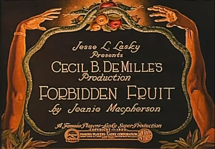
I wanted to take full advantage of the fact that it was being built in a software as capable as After Effects, while still embracing the theme by keeping things rooted in the 1920s.
The content for the deck came from a mixture of sources (including our team’s own data, metrics and wins from other teams, and milestones). Despite everybody's best efforts, there were a few delays with getting all of the content ready. While incomplete, I had enough information to go off of to begin ideating two different narrative directions to take.
  • A people-centered, win-driven narrative that reinforces the goal of highlighting individual contributions and accomplishments.
  • A numbers-centered, growth-driven narrative that illustrates the year’s strong performance as a company, and recognizes the accomplishments of the location’s different teams.
I sketched out two approaches to each of the possible narratives to get some of the prep-work out of the way ahead of the content being finalized. 
A people-centered narrative that's visually close to home
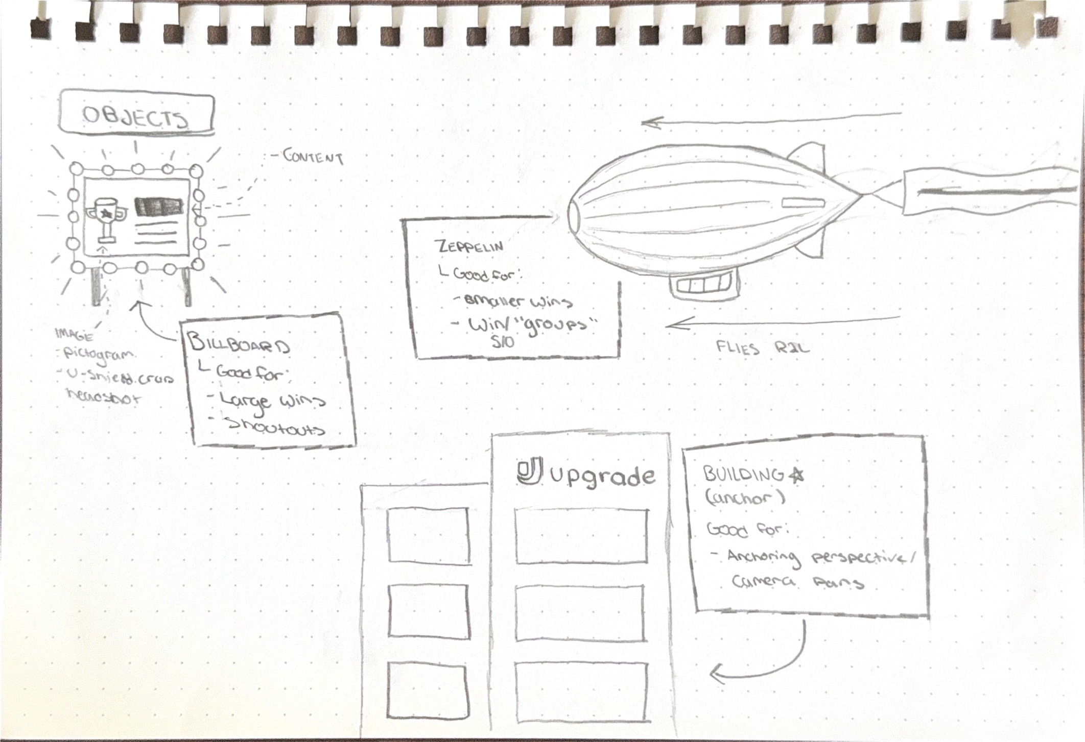
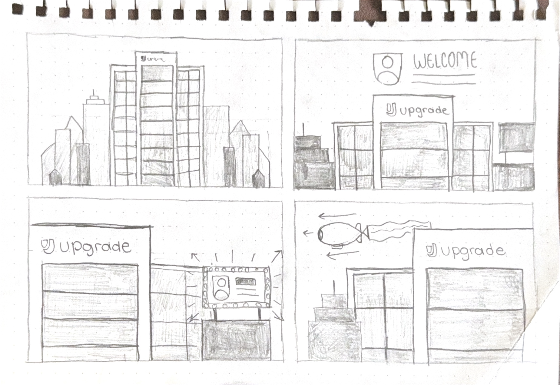
The people-centered narrative would focus heavily on achievements and topics local to the service center.
Because of this, I wanted to anchor this with an Art Deco-style cityscape scene with a modified version of the building's illustration used in the Phoenix location pictogram. Different objects such as billboards and zeppelins act as vehicles for different story components such as shoutouts, wins, and highlights. To give things a dynamic quality, the camera would shift to different sides of the building depending on the topic.
A flexible, numbers-centered narrative inspired by early film
The idea for the people-centered narrative was highly ambitious and relied heavily on a standardized form of delivery. The numbers-centered narrative embraced the variation of the content and took heavy inspiration from historically-accurate techniques in order to do so.
Since the videa is an ambient visual that won’t have a dedicated watch time, people’s attention will be coming in and out. Like most types of storytelling, visual storytelling relies on a linear story arc to see a narrative through; in this case, I won't be able to rely on the audeince's long-term attention so the storytelling will need to overcome this.
To help guide finding an on theme solution, I took cues from the storytelling practices and title/dialogue cards of the Silent Era. Popular silent films at the time managed to deliver resonant stories by following short, visually rich clips with dialogue cards that can be read quickly. Despite the fragmented nature of how the story is delivered, the use of straightforward and consistent aesthetics helps create a common thread.
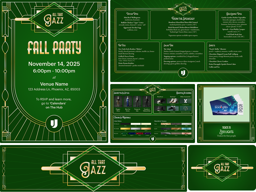
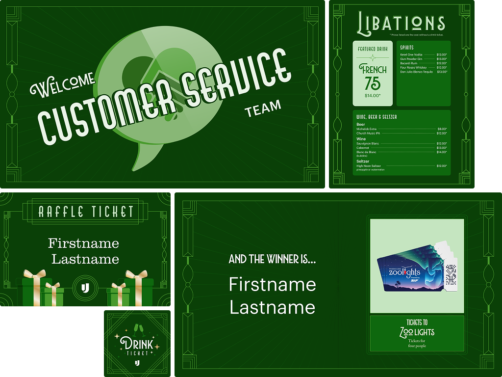
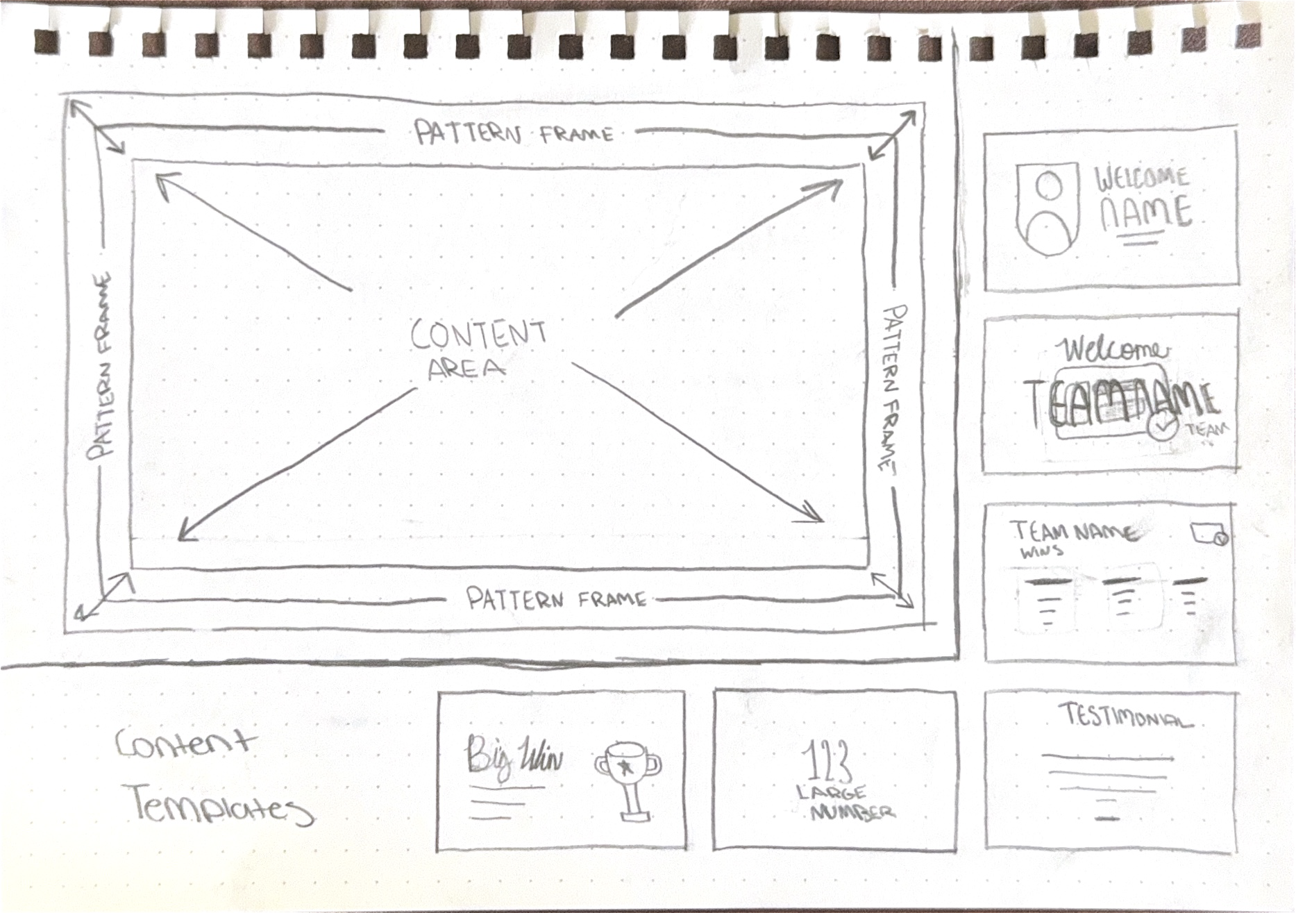
Based on the content that was already available and the deck from the year before, I sketched out a "storycard" template system that uses the party pattern as the visual common thread. There are 6 different content templates to fill the content area, each of which are tailored to the thematic needs of the content.
Due to this approach's flexibility, simplicity, and historical inspiration, I decided to pursue this approach.
While the people-centered narrative could've been a captivating showcase (and really fun to make), its need for new illustrations and content standardization would be a time-consuming effort to do well. The numbers-centered narrative worked with the variation of the content and required less additional work, meaning more time could be spent on elevation rather than just the basics.
Add surface motion
The content for this direction will use a leafless version of the pattern as its primary surface. As the visual commonthread, it was important to figure out the motion design for this first.
I wanted to give the surface a sense of movement and liveliness to make the viewing experience more immersive. I explored three possible directions:
Film jitter
Inspired by the rickety quality of old projectors, where the film "jumps" or "jitters" due to poor lens stabilization or unbalanced rigs.
While inspired by real antique characteristics, this cheapened the look a bit. While the assets for this party have been no stranger to using digital tools to mimic analogue limitations, this might've taken it a line too far.
Golden sheen
To explore the possibility of making this one of the few day-of gold moments, I applied the gold gradient to the pattern and animated a light sweep going across every 3 seconds.
This aligned more with creating a subtle but perceivable motion to the pattern, however I found that this broke the silent film dialogue card association a bit.
Ray rotation
This concept was a direct result of my asking myself "what would I do if I only had 1920s technology at my disposal?" Early animation came from each frame being drawn and traced out by hand, and I saw an opportunity to capture that frame-by-frame quality by rotating the rays.
While I obviously still used the conveniences of digital tools, I used a persistence of motion illusion rather than a simple rotation animation to create this effect. To do this, I set up a loop of three different background states of the rays rotated in increments of 2.5º. I experimented with each state’s frame rate before landing on a simple 1 frame per state.
Play speed (1 state per frame)
Slowed down (1 state per 15 Frames)
Design core instances and motions
To make sure I knew what needed to be done for each slide, I started off by organizing each piece of content by its theme, and designing templates to populate, the main categories were:
People Welcome
Team Welcome
Large Metric
Large win
Team Metric/Win
Customer Testimonial
Now that I had my static templates designed, I started to build the motion design for the individual story elements.
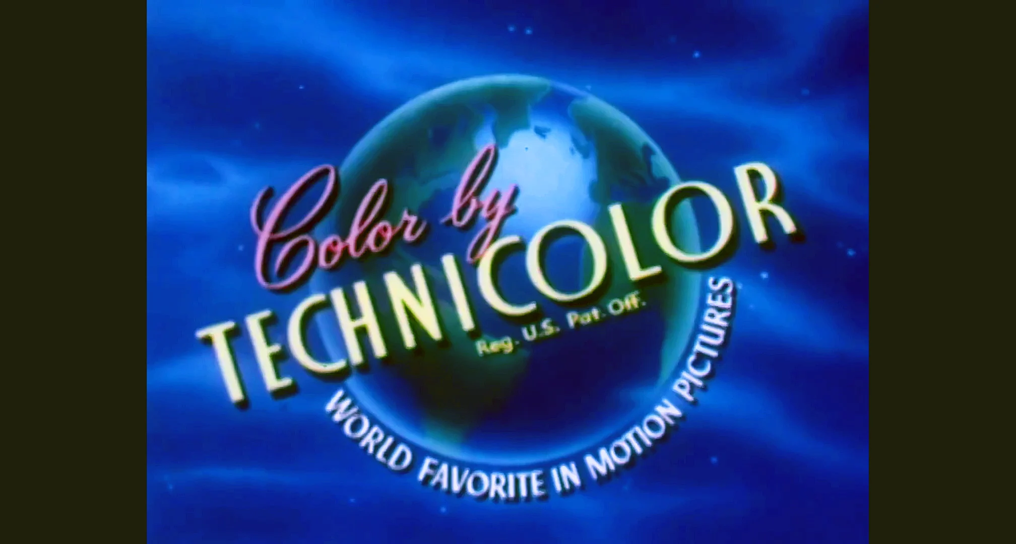
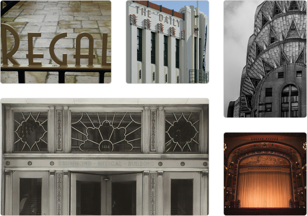
Since the main focus of this event is appreciating the work of Upgrade’s Operations teams, I wanted the team welcomes to be the most visually compelling. For these, I took inspiration from one of Technicolor's "Color by Technicolor" cards. While not entirely historically aligned (from what I could find, my source was from the 1960s) there were some heavy Art Deco influences in the type treatment that I wanted to emulate.
To riff on the pinwheel in the background, the department’s illustration reveal gives the appearance of it barreling forward by scaling up and rotating at the same time. Its final state is tilted at a 15º angle. Once the illustration finishes, the welcome text reveals itself while scales down with its opacity increasing, giving the illusion of the text materializing and floating in like a cloud. Both elements are then scaled down at the same time to remove them, which was maintained throughout the deck as an out transition.
Inspiration
Result
For the people welcome, I wanted it to have a similar intro card look but a little more subdued. A common technique in early animation was treating the mask as a physical element. I decided to do a similar thing by having the headshot scale up from the center as a circle, to mimic it floating up to prominence. Once the circle reaches full width, the shape mask will change to a U-shield while moving to the right.
I also decided to establish the standard text reveal instance, since the team welcome text animation and treatment will remain specific to those slides. Since many of the image and text slides use a 2 column grid, I animated the text to fade in and move to the left from behind the image.
Inspiration
Result
Large wins and large metrics had two separate treatments based on whether it was Ops-centered or generally business focused.
The Ops-centered variants use a 2 column image and text composition to make these pieces of content more of a focal point. Since the images used here will be illustration, I combined the illustration reveal animation established in the team welcomes with the text reveal animation established in the people welcomes.
For the business focused variants, I kept the composition simple with center justified text and a fade in animation. While
Ops-Centered Variants
Business-Centered Variants
Large metric reveal slides also had a counting-up animation applied to give the number more visual interest.
Since the team wins varied from team to team, I also decided to keep the design and animation of this composition simple and open ended. To accomplish this, I kept the standard limited to establishing header and body placement with the body content arranged in a flexible grid. Reveal animations would be kept simple by using an opacity fade-in.
Large Metric Reveal Example
Team Wins Example
Now that that the core instances were designed and templatized, I was ready to start mapping out the storyarc to put the full thing together.
Map out the story and put it all together
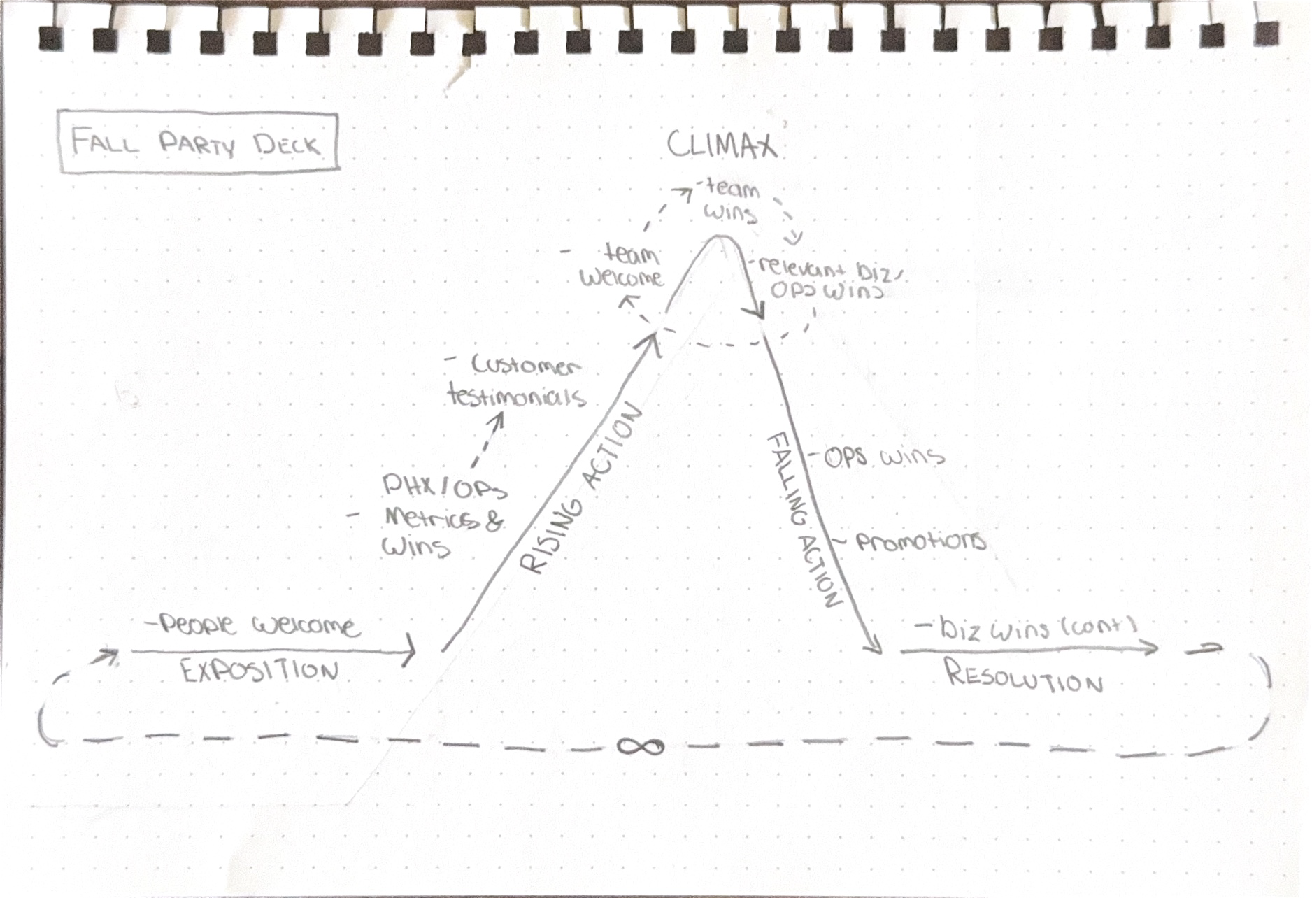
To kick off the storyboarding process, I mapped out the basic narrative arc based on the content of the different categories. Staying consistent with the plan to create little vignettes that can populate a larger story arc, I decided to keep things relatively aligned with this categorization.
Additionally, I knew that I wanted the team-specific content to act as the climax. With that goal in mind, I constructed the rest of the story to work up to and come down from that narrative high point.
I started things off by welcoming leadership first. This made sure these pleasantries were extended and set the stage for the importance of this event without making their presence the focus.
From there, I used some of the large metrics and wins related to Phoenix and Operations to help ground the story in showing gratitude for the work done this year. This included reinforcing the office’s total headcount (the office growing from 200 team members to over 1,000 in 5 years had been quite the internal spectacle,) and highlighting the investment in people’s growth by showing the number of promotions and a learning and development win.
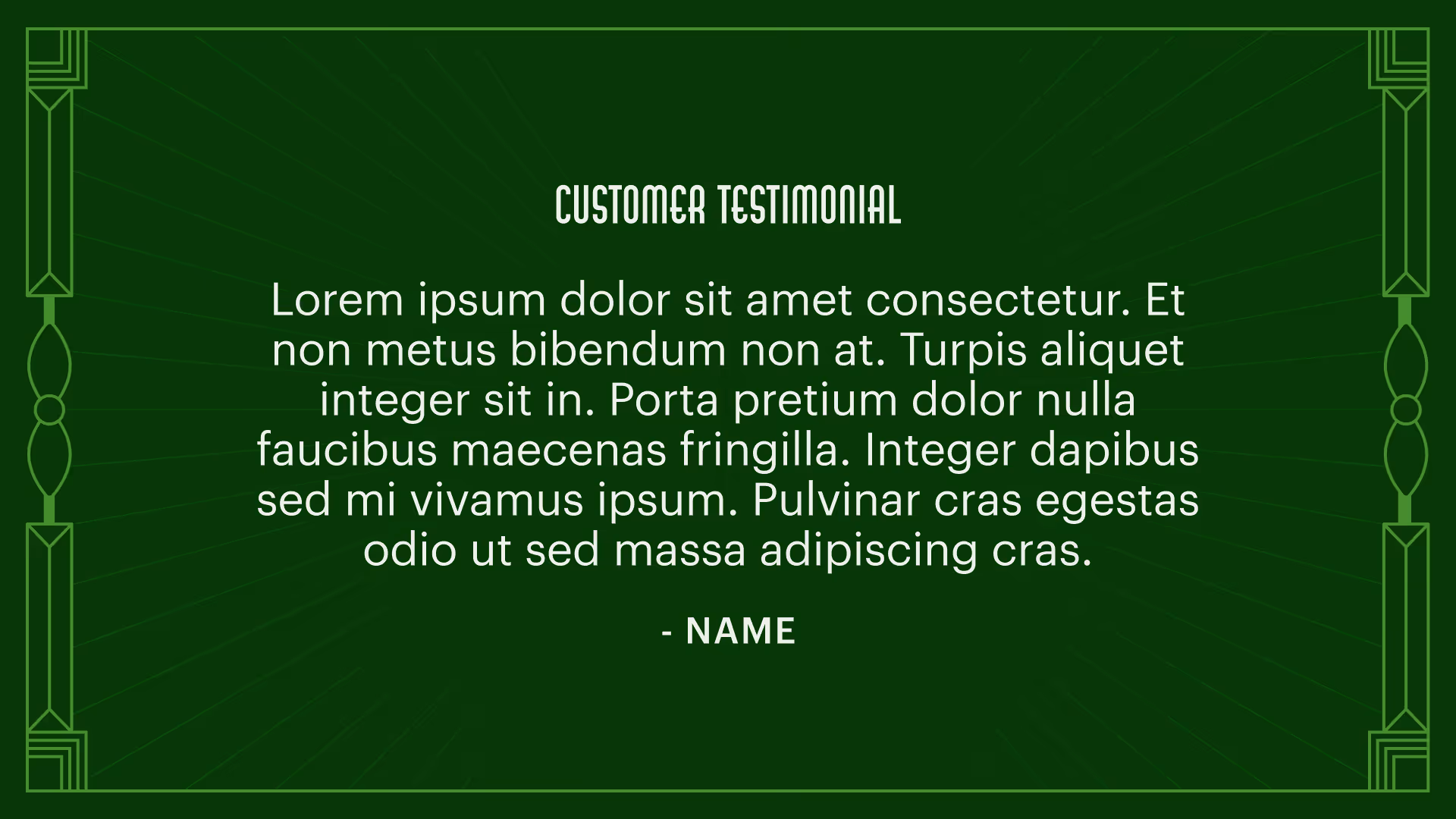
To further connect with the overarching story, I decided to have customer testimonials next. Headcount, promotions, and development wins can be compelling, but only to those with the full context of what that means. Using customer testimonials seemed like an additional way to reinforce the central theme of positive performance and growth, but appeals more to the story’s pathos.
I saw these first few sections as the exposition and rising action of the overall story. For the climax, I paired the team welcomes with the team accomplishments. Even though the team accomplishments are the center point for the climax, these story components had to be relatively self-contained as vignettes.
To balance the two priorities, it made sense to open with a team’s respective welcome as both a hook and introduction for their accomplishments, and then further separate each team by following with a related win/business metric before moving to the next team. Using this strategy helped construct miniature story arcs within the climax, accomplishing the goal of keeping things self-contained while contributing to a central story. 
At this point, all that was left were quite a few company-wide accomplishments. I saved these until the end because I felt that they did a good job of bringing all the localized story components together in a way that said “this is how the work has been marked in company history.” Putting this at the beginning could’ve accomplished a lot of what the customer testimonials and local wins did, but having it follow the executive welcomes would’ve made this seem more top-heavy than it should be. Since the video was going to loop, saving this for the end still keeps it proximal to the executive welcomes— creating a looping visual narrative with a circular arc.
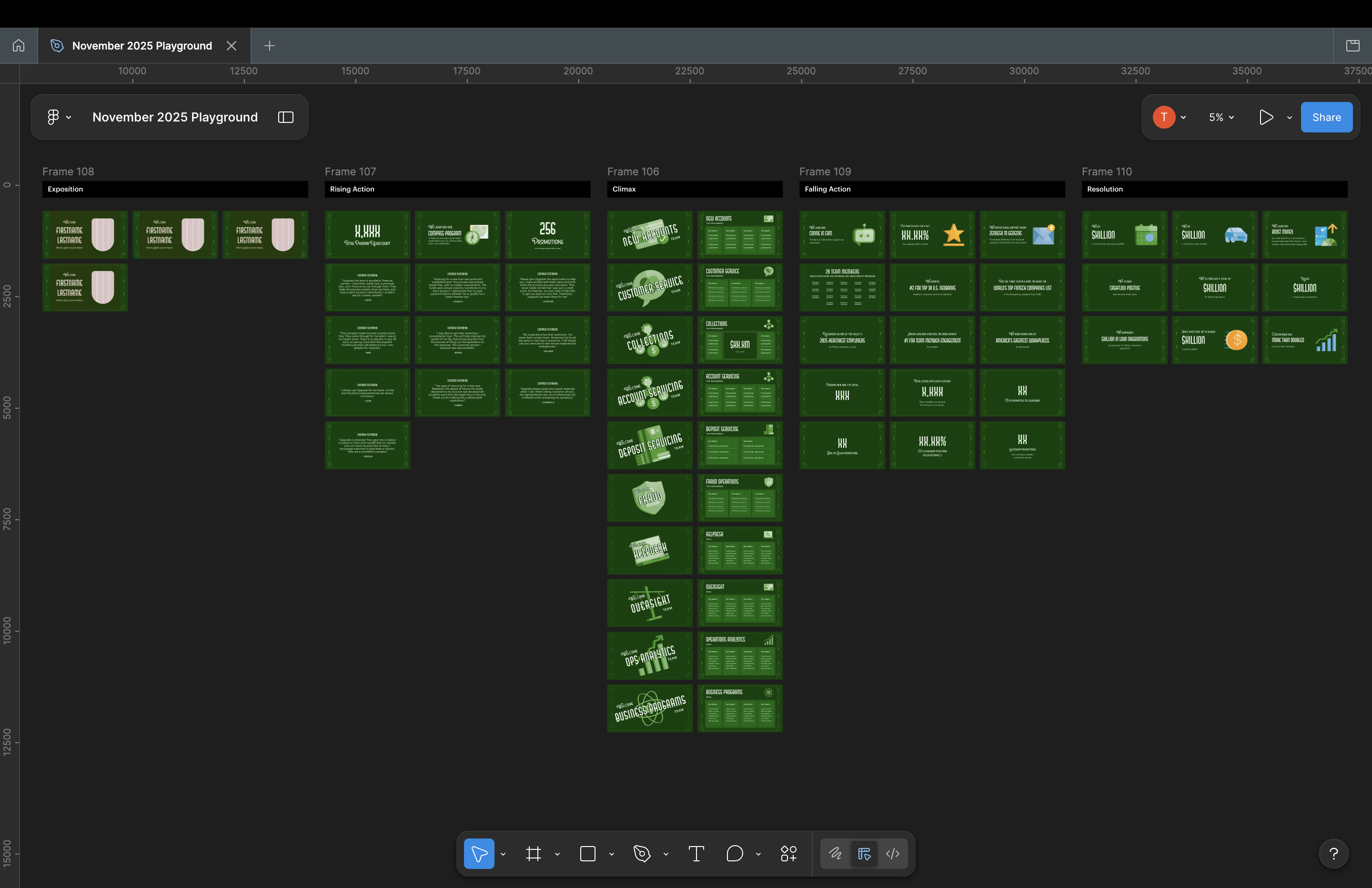
The final video itself was over 17 minutes long and contained some confidential information. Below is an abridged version containing a single person intro, the three exposition wins, a single team climax, three falling action wins, and a single resolution win. This is to demonstrate the sequencing and give an idea of how all the elements came together.
The raffle template
Approach the template tactically
Last year, the ticket drawer was also the one populating the slide. This was due to not specializing the two duties intersected by a template that wasn't hand-offable and had too much specialized information. As a result there would be around 15-30s delay between actual drawing and the name being displayed, confusion from winners about who won what, and mix-ups about retrieval.
While the raffle template was one of the many needed day-of visual assets, this posed more of a process and experience challenge than a visual challenge.
The raffle drawing would happen near the middle of the event after a few remarks from leadership. The drawings would happen in rapid succession, meaning speed and accuracy are the primary measures of success here. The space that was a dance floor would become a standing crowd, and the screens displaying the ambient video would become a display board for the different winners.
This meant verifying three key details:
  • The drawing order
  • The key pieces of information
  • The most accessible platform to host the template
The drawing order would dictate the order in which the slides are placed, and wouldn't be a blocker for proceeding with the template design. With this in mind, I started to work towards confirming the key pieces of information needed and finding the best platform for the template.
An information-first, pre-built design
One of the issues from last year was the fact that slide templates had too many information fields. In addition to the raffle item and the winner's name, there were also unique retrieval instructions for each item. This lead to confusion, mix-ups on next steps for winners, and overall caused delays in ther overall experience.
OET had streamlined the process this year to have a standard retrieval process for all items. In the interest of leaning down the amount of content used, cutting the instructions out of the design seemed like the most sensible.
Using the pattern system, and a modified version of the print raffle signage used on the ticket boxes, I designed a template with pre-built variants for all the different raffle items. For the winner's name, I used Graphik as it would be the most legible and accessible/easily replacable accross machines and platforms.
Ticket box Signage
Raffle Winner Slide Template
By populating and locking all known fields, and keeping the density of information low— I was able to create a simple to use and read template that could be updated quickly with little guesswork.
Implement with accessibility and replicability in mind
To ensure that this process wasn't fully reliant on my presence (as a contigency), I implemented the template in Canva. Canva was picked due to other event staffers' familiarity with the tool, and the fact that I would be able to share the template with external vendors (unlike Google Slides, which had sharing restricted to Upgrade employees only).
Additionally, I made sure that all of the prizes were listed in the order in which they would be drawn. This would allow for real time updates to be made on a laptop, while allowing the projected slideshow to remain in presentation mode. Before fully banking on this type of "choreography," I tested this ahead of the event with A/V. Based on that test and the actual event, this type of approach was possible.
While the set-up was simple, this ultimately worked out the issues from the year before and established a replicable process for large raffles moving forward.
Outcomes and reflection
An error-free raffle
Everything that went into the raffle slide template, from the ordering to the decisions to lean the content and keep continuity with the item showcases, seemed to pay off.
It was definitely a mad-dash as I populated the template during the actual event, but the template I designed helped me solely focus on naming and spelling. As a result, each slide was synced up with its respective drawing window, and the event organizers reported little to no confusion regarding who won or item retrieval.
A themed asset family the works together and honors the brand
The promotion and day-of colatteral were misaligned in 2024, and 2025 sought to correct that. With a thoughtful historical research, a brand audit, type exploration, a pattern system, and thoughtful use of color— I was able to create a consistent and differentiated suite of assets that tactically hit the goals of each component to the event.
While this outcome isn't as trackable as other success metrics, many people remarked to me and the organizers throughout the promotion period and night of the event about the visuals. By-in-large the remarks showed success with setting expectations during promotion, immersive day-of theming, and expressing the historical theme Upgrade's way.
audience remarks

check

"[The promotion poster] reminds me of 'The Great Gatsby'"

check

"I felt like I was watching a silent film [while looking at the video deck]"

check

"This is what I imagine [Upgrade] would look like if the 1920's look didn't go away"

check

"It feels like I'm in a speakeasy right now"

What I would've done differently
Overall, I am very proud of the work I did and how this project turned out. I've had an affection Art Deco design since I was a teenager, and I had alot of fun diving into researching and reproducing the style. Taking a style deeply rooted in history and applying it to modern contexts was a fulfilling and interesting challenge tackle, and felt right up my alley.
However, creating a sequence of this scale in After Effects was still new to me at this time. I figured that if I knew how to use the tool, and also how to tell these types of stories in deck form— then the process would be straightforward, right? It was not as straightforward as I thought. As a result of this underestimation of the time required, I had to cut a few chunks of content that would've needed unique instances. This included things like event photos, which weren't critical to the story, but could've maximized the impact.
If I had a chance to go back, I would've defined the narrative before prompting teams for content. Waiting for content to come in and using the raw bits to cook-up the narrative made sense in theory. Looking back, something this large would've benefited from a narrative being defined early on by me and my team before prompting teams for content. This would've allowed me to start the process for this a lot earlier.